By Jeff Martin
I remember in the 90s when web directories and web rings played a vital role in moving traffic along the web. Web directories often gave you enhancing options to your text listing such as bolding your title, changing your text color and placing my all-time favorite – ![]() the flaming HOT icon next to your listing
the flaming HOT icon next to your listing ![]() . Anything that set your listing apart from the others could really pay off. Google is allowing for this type of distinction by allowing Google Adwords advertisers who offer Google Checkout on their site a colorful icon that displays at the bottom of their ads in the Google search results pages:
. Anything that set your listing apart from the others could really pay off. Google is allowing for this type of distinction by allowing Google Adwords advertisers who offer Google Checkout on their site a colorful icon that displays at the bottom of their ads in the Google search results pages:
The Google Checkout icons may significantly help draw attention to Adwords ads that have the icon while at the same time become a problem for other ads. It could be argued that the icons offer an unfair advantage to ads with icons as:
- The icon takes up a line of text so that the more ads with icons there are on the right the less ad space there is for other ads. It’s possible that an ad that would normally show just above the fold on the right side may not show up without scrolling depending on the number of these icons.
- They may have a better chance of drawing the eye of users and the click away from advertisers paying more and/or with better quality scores.
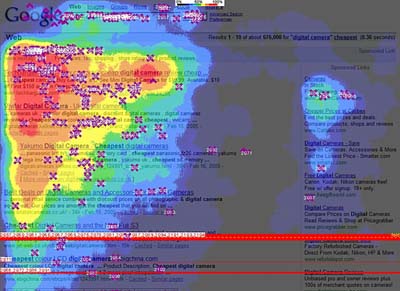
This is especially true in Google search results page real estate where it’s cheaper to place ads on the right and more towards the bottom of the fold of the page as these ads get less attention typically. Ads in this area with the icons may have more success now. The image below from an eye tracking study by Enquiro illustrates this as the “hotter” the color the more visual attention the real estate receives (the thick red bar towards the bottom represents the typical fold of the page):

As more data is collected we should know more about the ramifications of the Google Checkout icon for those who have it as well as for those who don’t.


As a paying advertiser with Google, this has always bothered me. My eyes naturally flow to the Google checkout listings and I feel it does create an unfair advantage. Why should Google charge me the same or even higher, and allow an unfair advantage towards listings that benefit Google, and not me, their client? Makes no sense, and it feels wrong in my opinion…
http://www.ProDryers.com