Chromium “Never-Slow Mode” to Truncate Large Page Content

Chromium is the browser rendering engine used by Google Chrome, Microsoft Edge, Opera, and a number of other Internet web browsers to convert the HTML, CSS, Javascript, and images into the web pages you want to see.
The Chromium developers recently committed a new “Never-Slow Mode” set of changes to the prototype Chromium codebase in order to test out some new features designed to speed the rendering of web pages.

Note that this is currently a prototype, but it can also serve as a “Coming soon to a web browser near you” comming attractions trailer of where Chrome, Edge, Opera, et al will be heading once this codebase gets integrated.

Why Should You Care?

Nowadays, page bloat is becoming a bigger problem: large code modules, multimegabyte images, and bloated CSS all contribute to slower loading web pages. Newer Web Frameworks technologies like Angular, React, Ruby on Rails, et al, depend on larger client-side payloads and the browser doing more of the heavy lifting on rendering a web site. Easier site development comes at the cost of more work for the browser to render the content, and downloading all the components to make that function comes at a file size and rendering time cost.

Even without those Frameworks, web page size has grown as faster mobile networks and widespread availability of broadband Internet access has made dialup (and it’s draconian speed limitations) a thing of the past. Page speed is lower on a designers list of requirements, and page-bloat is the result. The “Never-Slow Mode” proposed by the Chromium developers would set hard limits on the individual component size and total size for that type of component on a per-page basis. Some of the currently proposed limits are:

Component Type Max Size Per Item Max Size Per Page
Images 1 MB 2 MB
CSS 100KB 200KB
Javascript 50 KB 500 KB
Total Connection Limit   10
Long Task Limit 200 mSec  

Future enhancements already announced include limiting IFRAME nesting depth and a “Feature-policy” header which can trigger on a per-page basis. Currently, the prototype has no UI to inform users that a page is slow and subject to these thresholds/limits.

Since it is still in the prototype stage, it is not clear whether and when this Mode would be turned on. Would it be off by default for both Desktop and Mobile users? On for Mobile only? Turned on automatically when in a slow-bandwidth network area? It is not currently clear.

Page Speed Is Important

Google believes strongly that pages should load quickly, and has already made several steps to help:

  • Advise: Provide their Page Speed Insights Tool for testing and grading a page’s speed on mobile and desktop
  • Penalize: Google is using page load time as a Google Ranking Factor to downgrade slow-loading pages in the SERPS
  • Speed Delivery: Google developed the AMP architecture to allow for fast, lean mobile pages

The Road Ahead

It appears that Google is approaching the point where they will move away from advising on slow pages, dunning slow pages in the SERPS, and providing an alternative delivery mechanism to actively trucating large sites/site components.

As a Site developer, it would be prudent to get jumpstart of ensuring that your site can run efficiently with these proposed limits in place or risk having the site degrade (possibly badly) once these new features are made mainstream. ChromeStory has a little more detail.

New Filter Fields in Google Analtyics

Google Analytics LogoIf you’re an intermediate to advanced user of Google Analytics, you’ve likely used Filters to manipulate data into something you can understand and work with.  One example would be the tweak I shared to demystify the black hole of Not Provided.

Earlier this week Google Analytics announced the availability of a whole herd of new filter fields.  The new fields heavily target those with high-volume mobile traffic, but don’t feel left out if that’s not your niche, there are also some interesting non-mobile options, or options that can be combined with mobile if you like.

Here’s the full list with some thoughts after the ones that stick out.

Continue reading

Three Things People Really Hate About Your (poorly) Optimized Content

Optimizing content is a process by which relevant keyword phrases are included in text on a web page.

3 Things people hate about your (poorly) optimized content

WELL optimized content is a whole other animal.  Anyone can write some text and cram some keywords into it.  Writing text that pleases users, and search engines, is an art.  Not everyone can do it, not everyone should.  I thought of some things I’ve seen recently that drive this point home.  If you cant do this for your own content, hire a professional.  You wouldn’t ask your mechanic to write your marketing plan, would you?

Here are 3 things people hate about your optimized content
  1. There’s way too much of it.  How much content do you need on a page?  Enough.
    Tell the story, tell the ABRIDGED story.  You don’t need 1,000 words on the page to rank because you read it on some website 2 years ago.  You need text, but 250 +/- words that get directly to the point will serve you, and your reader, much more efficiently.
  2. It’s hard to read.  You included no paragraphs, content breaks with bullet points, bold main ideas, or images.  It’s just text on the page.  Boring.  Sorry – people don’t read content that looks like this, and search engines know it.  Engage the eye to engage the reader.
  3. It makes no sense.  This generally comes in from 2 avenues.  First, you crammed too many keyword phrases into the page and it reads like a keyword research document.  Tell the story with words people would use to find it, don’t repeat those words in every sentence, that’s overkill and makes your content nearly impossible to read and relate to.  The second avenue comes from machine or non-native speakers.  We always recommend that content be translated into the target language by a native speaker.  Someone who understands the nuances of the language and can reform sentences so they make sense.

It’s okay to not be good at something.  It’s okay to hire someone to handle things  for you.  This is probably the topic for a whole other post.  If you need well optimized and user friendly content.  Take the time to do it right, or hire an expert to do it for you!

Are You Ready? Are You Sure?

I recently ran across a promotion from McDonalds that lined up with the Olympics.  I was in the store, eating with my family on vacation, and had to visit a website to enter a code to be eligible to win.  The only device I had available at the time was my smartphone.  I imagine just about every single entry for this contest comes from a mobile phone due to the way the contest was set up and the game pieces were distributed.  Here’s the issue, I had to fill out a form that was about 15 REQUIRED items long, and every time you clicked on a box to fill it in, the entire page scrolled to the bottom.

SO FRUSTRATING

Once I finally got the form filled out, I thought I had submitted my registration correctly, but when I entered the codes for the game, I was given an error Continue reading

Tips For Optimizing Your Site For The Sale

Often times we get so bogged down in the minutiae of keywords and content that we sometimes forget to look at the overall goals of our website. Making the sale, collecting the lead, enticing the click; these are all ultimate outcomes we want for our websites. Sometimes our choices are counter-intuitive to those outcomes.Optimizing for the Sale Whenever we perform a website evaluation, the “ultimate goal” is in our minds. A product sold, or a lead collected has to be the summit we work towards. Forgetting where you want to end up can sometimes mean a winding road along the way. Keep these conversion optimization tips in mind as you tweak content on your site.

Continue reading

What’s in Your Toolbox?

Every marketer who handles multiple aspects of online presence will tell you, we change gears so much, and have fingers in so many buckets, that having tools to help us monitor and keep track of campaigns is essential.  That being said, there are a ton of tools out there to choose from, and everyone has an opinion on what the best ones are.  I generally talk from experience when it comes to tool selection.  I don’t recommend that which I don’t use, and I am pretty picky about usability when it comes to software.

My favorites are the ones that I can figure out without reading a manual.  I’m terrible about instructions.  I want things to be intuitive and easy to use, so multi-step screens and

Continue reading

From The Ground Up – SEO-Friendly Site Construction – Part 2

In our first installment of From the Ground Up, we talked about creating a solid website architecture based on keyword research and a logical hierarchy of pages and content.  Today we’re going to get more in depth with creating a content plan and naming URLs for your new website.

We need to talk about URL names from two angles today – a brand new website, and a redesign of an existing website.  Let’s start with the redesign.  If you are redesigning your website, and  if you don’t have to rename your URLs, don’t.  Some platforms will allow you to keep the current URLs you use for each content page.  If this makes sense with your new website structure and page names, don’t change them.  New URLs mean creating 301 redirects from old pages to new pages.  This will cause you to lose some of your link benefit coming to those old pages.  If your website directories, folders and page names make sense, are hierarchical, and can be translated into your new site, by all means, do that.

In a perfect world, URLs don’t have to change – but in probably 90% of new website designs, we’re talking about a platform change.  Likely you’re changing from one programming language to another, one blogging platform to another, or even one philosophy to another.  This will cause us to have new URLs for existing content.  We recommend using a smart system for naming new URLs, and a plan to create 301 redirects before a page is even created.

In our last post, we talked about taking every URL on your website and placing them in a closely related category or theme.  Some categories or themes may live Continue reading

Mind Your P’s & Q’s In Quality To Avoid Google’s Panda Updates

Last week at the SMX East conference in New York, I both sat in on sessions concerned with Google’s Panda algorithm updates and spoke on one of them. One thing which really struck me is how extraordinarily unified fellow search marketing experts were about both the causes and solutions to sites which were impacted by Panda! Each marketer spoke about improving sites’ quality, usability, and overall user experience (“UX”).

Mind your Ps & Qs to Avoid the Panda Updates
Panda photo by J. Patrick Fischer, CC BY-SA 3.0

For those of us who have been following Google’s evolution over time, the Panda updates actually weren’t all that surprising. For me, the emergence of Panda seemed very familiar, harkening back to perhaps as far back as 2006 when Google clamped down on affiliate sites. At that same time, Henk van Ess revealed how Google was hiring on temporary quality evaluation staff to rate search results. In Google internal documents which van Ess exposed, the evaluators were instructed to give poor ratings to spam content, porn ranking on inappropriate keyword phrases, and “thin affiliate content”. It became clear very quickly that the negative human ratings for “thin affiliate content” were related quite closely to the virtual penalization that many affiliate sites experienced at that time.

What Google was focusing upon in reducing the ratings of “thin affiliates” were instances where a search results page would be filled up with links to pages which all had virtually the same content, and where those pages often weren’t the final destinations of the people who landed upon them (obviously, with most affiliate sites one clicks-through to the actual retailer’s site where more information could be found and orders could be placed). From Google’s perspective, it was a poor user experience for there to be millions of pages indexed which had all essentially identical content and which often edged out other more-worthwhile pages which consumers might prefer.

From all of the information around the “Panda” Updates, it seems highly likely to me that Google is continuing to leverage their human quality evaluator staff, along with a number of other automated metrics which they could also incorporate in determining quality of pages. Continue reading

12 Tips To Optimize For Google Instant Previews

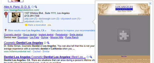
Earlier today, I outlined how Google’s Instant Preview doesn’t display Maps, Flash, YouTube, AJAX, and lots of other rich media commonly found on webpages. If your site pages or homepage have this stuff on it, chances are your Instant Preview image is less-than-stellar and may actually reduce your CTR.

There are a lot of professional websites which have “borked” Instant Previews. For example, check out this Los Angeles dentist’s homepage, which appears with this jaunty giant jigsaw puzzle piece taking up most of its space:

Los Angeles Dentist Website Instant Preview

Google has said that the Instant Previews were found to improve their users’ satisfaction with search results significantly during internal testing prior to rolling out the feature. Users can rapidly glance at the preview images to see if the webpages might hold what they’re looking-for, increasing their confidence and helping them select webpages to click upon which are more likely to hold what they want, avoiding clicking on stuff they don’t want.

If that’s true, then the opposite is likely also to play into users’ behavior: if a preview image looks bad and doesn’t look like what they’d expect or want, they might avoid clicking on it.

For anyone who has a site which doesn’t look right in Google Instant Preview mode, this is alarming, since their introduction of this feature could wrongly reduce your clickthrough rates. Even if you’re not worried about the collective effect over time, you still are likely not thrilled that the image representing you may not reflect a true picture nor show you up in the best light.

I’ve been asked before on how to optimize for Google Instant Previews, so here are a few tips I’ve put together: Continue reading