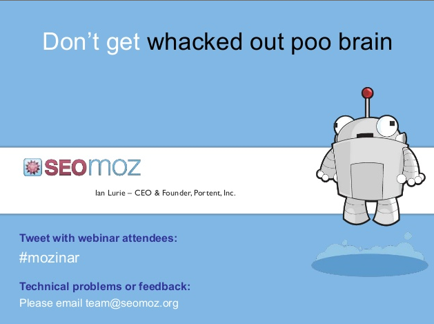
Don’t Get Whacked Out Poo Brain – a Webinar Recap from SEOMoz and Ian Lurie

I attend a lot of webinars.  Learning, and brushing up on techniques is what keeps us good, and on the edge of what matters to clients.

The first thing I noticed about this webinar was the Title.

Click the image above or get the slides here: http://www.slideshare.net/wrttnwrd/time-management-for-marketers-the-mozinar

“Don’t Get Whacked Out Poo Brain.” – If you’re a fan of Adventure Time – how can you stay away from that?  If you’re not, stick with it, because the context will provide the definition.  Here’s a link to the recording over at SEOMoz.org/Webinars

Presented by Ian Lurie –  this webinar was crammed with ideas and gems to help marketers get organized, minimize distractions, and keep track of ideas, thoughts and creative processes for a marketing campaign.

I loved it!

I am one of those people who always has ideas and thoughts crowing their brain.  I think about marketing at the grocery store, when I’m trying to fall asleep, during movie with the kids.  What I struggle with is recording, recalling and using those ideas when it really counts.  I get distracted and interrupted and forget what I was doing, or what project I was working on.  I think, as someone who works from home most of the time, this is one of those hazards.  Home is distracting.

In short – I get “Whacked out Poo Brain” a lot.  It’s an issue that I think many of us struggle with. 

My favorite Takeaways:

  • Work in Sprints – Ian uses 45 minute  sprints and a modified version of the Pomodoro method.  I think he said they recommend 25 minute sprints, but that wasnt long enough for him to finish many tasks.  I’m going to start with 45 minutes and see how it goes.  Not many of my tasks go as fast as 25 minutes.
  • Ian loves Adventure Time – So Does my 11 year old…do with that information what you will.
  • Sweep through your tasks and priorities every morning.  Take the first 3-4 on your prioritized list and work on them in 45 minute sprints.  Revisit if you have a 5 minute break to see if you’re on track.
  • Every task should be classified as follows:Keep track of every question you ask an answer.  Keep it in a knowledge base, either private or shared, so you can cut down on interruptions with the same question, or find your answer much faster.
    • Can it be done in 3 minutes or less
    • Can/should someone else handle it?  Delegate it.
    • Will it take longer?  Create a task or a milestone and add it to your list

Tools – Check out Ian’s Tool List: http://portent.co/poobrain

  • NOTE: This is not billable hours tracking, its YOU tracking.  Do it right away, don’t wait and try to remember what you did that day.


Designing User-Interfaces For Best Internet Marketing Performance

For quite a few years now, I’ve been theorizing that the practices of User-Centered Design and Usability might eventually supplant Search Engine Optimization (“SEO”). Google has progressively tried to reduce effectiveness of mere technical tricks and tweaks, and they’ve improved their ability to overcome common site infrastructure issues in order to be able to access and rank content.

My theory has been supported to a degree by the announcement that Google was planning to incorporate website speed into the 200+ signals they use in their algorithm to rank webpages.

But, there are even more compelling arguments for focussing higher levels of priority upon refining your website with usability in mind. Highly usable sites make it easy for consumers to find what they’re seeking rapidly, and don’t frustrate their audiences. Usability impacts performance over the long-term, and that has a direct effect on market share and future growth. Google itself prospers on this philosophy, and other sites like Craigslist are similarly successful because they are simple and usable.

For these reasons, one of the standard services that KeyRelevance provides is a careful and comprehensive Usability Review. Optimization of a site in order to streamline user interactions will help to make all other site promotional activites such as SEO and PPC advertising more successful.

Google Browser SizeGoogle Labs provides a very useful tool for analyzing one of the many aspects of Usability which we commonly look at when reviewing clients’ sites. The Google Browser Size tool allows one to input the URL of a webpage, and they provide a semi-transparent overlay which outlines the area on the page which is visible to certain percentages of users viewing on various sizes of monitor screens and browser window dimensions.

This is extremely similar to an analytic tool I created quite a few years ago which “sniffed” my website visitors window sizes when they visited the homepage, stored the values, and then provided percentages of size ranges. Such tools are invaluable when writing the specifications for site designs/redesigns.

The reason this is so important is that one should not create a website design that is so large that key elements are pushed outside of the viewing area horizontally. The vertical area is important as well, but it’s considered of far greater importance to be careful with width, because it’s expected that very few consumers want to scroll horizontally, so content falling off the right side of their screens simply gets missed.

The area of a webpage which visitors can see initially upon arriving, without any scrolling, is called “above the fold”, using old newspaper terminology. Many studies have supported the premise that content “above the fold” on a website typically will receive the most attention and perform the best.

Many designers are using much larger monitor sizes than their site visitors may have, often resulting in designs which do not fit the audiences they’re targeted-to. The egos of corporate employees often figures in as well, and there’s a human tendency to be impressed with larger, graphically-intense splash pages with too much key content falling outside the horizontal width or below the fold for many users.

Magazine sites frequently neglect to design towards internet users, perhaps because their designers may often be more accustomed to print media design where there are far fewer variables in designing a common user experience for the audience. For example, Vogue’s website when viewed with Google Browser Size shows that a significant percentage of the audience will not see content on the right side of their homepage, including the important badge ads that are intended to generate revenue:

Vogue's Homepage Size vs User Browser Window Sizes

You can see that their masthead navigation links for “International” and “Video” are falling into the band of “90%” in Browser Size along with the site search form – this means that 90% of internet viewers are viewing pages with their browser windows large enough to see that right side content. The other 10% are not able to see this content, and might miss that it’s available. I’d bet that if we looked at Vogue.com’s analytics we’d find that those links get significantly lower click-throughs compared with more-commonly-visible areas on the page.

When we look into the 95% band, we see header links for “Renew”, “Parties”, and “Style.com” get lopped out of the viewing area, along with the ad content.

Vogue’s site is designed to be about 980 pixels wide – at the upper end of the typical range of non-dynamic width websites. When you see how the larger size results in a less-optimal experience for 5% and 10% of their overall audience, one can’t help but ask if the designers could have created a design at a smaller width while still retaining all the beneficial aesthetic value. I’d say that they most definitely could have, but they likely were ignoring the statistics when they set the site design specifications.

The wider design represents a lot of untapped opportunity, and money left on the table. While 10% may not seem like a large percentage, when you figure how many visitors Vogue’s website must receive annually, the raw numbers of people that fit into that demographic really add up. That 10% of people whose monitor screens were likely too small to easily see that right-side content on Vogue resulted in fewer people clicking through to view the Video content, International content, and the search form. The 5% of visitors would have missed the “Renew” link and the ad content, resulting in a little less revenue.

If you’d like to see a site that’s done a far better job of setting their size with user browser window limitations in mind, check out Nordstrom. Their site fits in a width closer to 770 pixels, making it work for a much greater percentage of internet users.

There are some caveats to using Google’s Browser Size utility. For one, the striations of browser size percentages that they display in that tool are based upon Google’s usage statistics, and not your site’s. While Google certainly has a huge usership sample to base these numbers upon, your site may have a significantly different demographic of users who have larger or smaller monitor sizes and browser window widths.

Google’s Browser Size utility is a fast way to check size based on overall internet averages, but if you want to do even more precise checking of your audience’s capabilities you need to check your analytics to see how many users are accessing your content with what size of windows and/or monitors. Here at KeyRelevance we do calculations based off of your analytics package for this — a lot of top web analytics (such as Google Analytics) will give you detailed numbers over time.

Regardless of which method you use, you need to take browser window size into account when redesigning your site. This is an easy way to bake more success into your website without trying to do anything complex or tricky.

XMen Origins – Wolverine & 20th Century Fox Miss The Online Marketing Buzz

This past weekend the internet was buzzing. What were they buzzing about? The movie trailer for the new Wolverine movie coming out. It wasn’t on main stream news, where it was buzzing was on social networks, social news sites, video shares and forums as well as social communication channels like Twitter.

The trailer hit theaters as a lead in to the Keanu Reeves’ movie, a re-adaptation of “The Day The Earth Stood Still“. The first real big buzz coming Friday night. A smaller bit of buzz about the Wolverine movie came during Comic Con this year where they showed a slightly different trailer.

So how did 20th Century Fox stumble out of the gate on this one? There’s several ways, and as a marketer who’s well versed in online media, it just frustrated me to no end that these big movie houses still just do not get online marketing in any sense of the form.

What Happens When You Can’t Find The Website?

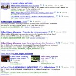
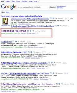
Let’s start with their website. Think you can find the official Wolverine website by typing in Wolverine Movie? How about Wolverine Movie Trailer? How about using it’s official movie title “X-Men Origins: Wolverine”? Nada – Zippo – Zilch. All through out the weekend I tried, today I took screen caps – no where in the top 10, take a look below (click the thumbnails to get a larger view).

Wolverine Movie Google Search   Wolverine Movie Trailer Google Search   X-Men Origins Wolverine Google Search

X-Men Origins Wolverine Official Site Google SearchTheir website is in flash, totally absolutely in flash with absolutely no content a search engine’s spider can read. The only thing it can read is the title tag for this site. Talk about being invisible to the search engines, and to the rabid Wolverine fans! It wasn’t until I typed in “X-Men Origins: Wolverine Official Site” did I get the movie site to come up in Google. Now tell me who the heck is going to type that in, other than me who was bound and determined to find the official site?

Video, Video, Video… It’s Where the People Are At

Now lets go to the subject of the trailer. Talk about needing to loosen control! 20th Century Fox definitely needs to loosen their death grip if they aren’t going to put their trailer out on their site the same day they release it in a movie theater. They also need to realize that when they don’t come up for “Wolverine Trailer” for their own site, they need to have it ranking else where, or someone else will. On Friday, Saturday and early Sunday there was still no Wolverine trailer on the official site, what in the world is wrong with their marketing team? Granted today when I went out to look the trailer is now there.

People were clamoring to see this trailer who didn’t want to go see this movie. Let me tell you, as a comic book gal, and a XMen fan from my childhood years, I was clamoring to see this trailer. I’ve been waiting like the rest of the XMen fans since the last movie to get more. We all scour the internet for clues, tidbits and the slightest bit of information we can glean to satisfy our need.

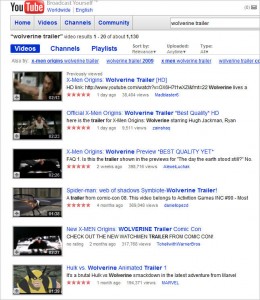
Thus why looking for this trailer became an obsessions with not just me, but others as well over the weekend. According to Groundswell, the author Charlene Li, points out that 29% of the people in social media are watching videos other people have made. Google was pulling down more trailers of Wolverine this weekend than you can imagine. But people were still searching for this trailer on YouTube and any other video share they could find.

Wolverine Trailer Search on YouTube

The Fans Take Action…. 20th Century Fox Misses Out

I did find it on another video share, I’m not going to say where, because I don’t want to see it taken down. I found another trailer from Comic Con too – and what’s amazing about that video, it captures people cheering during the trailer, talk about fandom! Cheering during a trailer – now that speaks volumes.

People were videoing the trailer from their phones while in the movie The Day The Earth Stood Still. They uploaded it to video shares and blogged about it. Why did they do this? 1) they love XMen, Wolverine in particular 2) they recognized that 20th Century Fox wasn’t filling their need or the need of others.

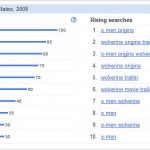
No where on YouTube is there an official Wolverine, 20th Century Fox, or Marvel Channel for the movie. What 20th Century Fox doesn’t realize is that there is real buzz going on about this movie. One look at Google Insights tells the story. Just over this weekend searches for Wolverine skyrocketed, several terms are break out terms with searches increasing over 1000% (I don’t get the big surge in Michigan though). None of these terms are pushing traffic towards the official XMen site either, and if you notice, none of these terms use the long arduous title that 20th Century Fox Does.

click images for a larger view
Google Insights - Wolverine - Trend and Map Data  Google Insights - Wolverine - Search Trend Data

So this leads to showing you the audience, a lesson in strategy in combining both SEO and Social Media strategies together when you are launching something big. When you understand online media, and aren’t having such a death grip on control of your brand, you can reap huge rewards. Unfortunately for 20th Century Fox, they are just making their fans of XMen and Wolverine not like them very much.

And btw the way, yes I did a fan girl squeal when I saw Gambit. 😉 ahhh Remmy LeBeau makes me weak!

eMetrics: Google Analytics 6 New Features & Improvements

I think Google’s outdone itself here. Seriously!

I already had a sneak peak this morning at something I knew Google Analytics was changing. I figured “that” was the announcement at the 2 p.m. special session in the ballroom here at eMetrics Marketing Optimzation Summit. Early this morning, I was surprised to run into my friend Avinash Kaushik in front of the WAA booth, because he told me back in August he wouldn’t be here at eMetrics. I had a feeling something “big” was onhand.

I mentioned to Avinash, about the change and asked if that was the announcement. He smiled in his “coy” way and just said “Li, make sure you are in the ballroom at 2!” Needless to say, Avinash doesn’t have to say anything to me twice, I get it. So I was there.

Not 1, not 2, not even 3 features or improvements, they announced 6!

So here’s a quick rundown:
1. Interface changes
2. Adsense Integration
3. Visualization Charts (these are way cool looking)
4. Custom Reports
5. Segmentation
6. API! (this got huge cheers from the audience)

I’ve got video on three of the announcements, I’m working on getting them up to the web, so you can hear Avinash explain it in his own words.

eMetrics & Google Analytics a Key Relevance Review of Day 1

Google Conversion University - ProfilesYesterday was the first day of the eMetrics Marketing Optimization in the Washington DC area. The conference runs until Thursday, and I’ll be posting some highlights from the eMetrics conference.

Google was one of 4 special sessions yesterday that eMetrics hosted on this first day. The other three sessions were eMetrics Industry Insights Day, Web Anayltics Association Base Camp sponsored by Omniture and Intelligent Research, Targeting & Measurement of Interactive Ads & Audience. In the all day session on Conversion was focused upon Google Analytics for about 95% of the time, and some focus on current and upcoming tools Google is working on.

In the Conversion University presented by Google Analytics session, things started off pretty basic with a basic overview of where Google Analytics came from, as most online marketers know, Urchin was acquired by Google back in March of 2005. Urchin itself, was started back in 1997, so it had been around measuring website analytics for quite a while. After the acquisition by Google (shortly after Urchin launched its Urchin on Demand product), Google launched its analytics in November 2005. It’s amazing to me it has been nearly three years since that launch – wow does time fly.

From the history we dove into a lot of different things with Google Analytics. From filters, to exclusion of parameters, to profiles and making them for special groups, subdomains, blogs, etc., there’s a lot of ways that small businesses can make Google Analtyics a powerful resource for gaining insights into what can improve their conversions. The most surprising thing to me, is that there is a lot more than I really ever thought.

I’ve been using Google Analytics since the inception of Search Marketing Gurus, but I’ve never taken the time to dive deeper than what is at the surface. Now that I’ve been introduced to the more powerful features, you can bet I will be utilizing them. Sometimes reading a book can inspire you, but for me actually sitting in a class, and having the tools demonstrated live, works even better to motivate me.

Discussing Google Analytics\' ProfilesThe class went on to work with hooking Analytics up to your Google Adwords account, how you can track down to the finest minutia of what is working and what isn’t working in your online marketing campaign with Google Adwords. It’s rather easy for small businesses to do, and easy if you are someone who is managing the PPC campaign yourself.

The end of the day was dedicated to Google’s Website Optimizer. Talk about a powerful tool, that FREE. Anyone can now take advantage of website optimizer, you no longer need to have a Google Adwords account to do so. So if you want to do A/B testing, multi-variant testing or split testing, Google’s Website Optimizer can handle them all. It’s really a neat tool, and you can use it to test colors, buttons, banners, text on the page and just about anything that you think would enhance or detracts from the visitor converting on your site. Remember conversions isn’t just buying something, it’s subscribing or commenting too!

The last part of the full day session went over other Google tools such as Google’s Webmaster Tools, Inisight and the currently in beta AdPlanner. AdPlanner is some very powerful stuff, and the representatives in the room with the instructor, Justin Cutroni of EpikOne, told us that the data that AdPlanner uses does not come from Google Analytics or Google Accounts.

Overall, I’m really glad I picked the the Google Conversion University. Sometimes as marketers we take for granted the “top level” of tools and don’t dig deeper, either because of time, or resources, or maybe that’s someone else’s responsibility. It’s great to get this kind of in-depth perspective, and it’s definitely a great reason to come to this conference. For some quick insights, hop over to my “A Morning at Google Analytics University” review on SMG.

Key Relevance Review of Google Automatic Match – Measuring the Cost of Skipping Keyword Research

by Jim Gilbert and Mike Churchill of Key Relevance

Automatic Match is Google’s new feature that allows AdWords managers to receive clicks in their PPC campaigns without the need to select specific keywords. According to Google:


Automatic matching

Automatic matching is an optional feature that helps your ads reach targeted traffic missed by your keyword lists. It works by analyzing the content of the landing pages, ads, and keywords in your ad group and shows your ads on search queries relevant to this information.

The automatic matching system continually monitors your ad performance and aims to show your ads only on queries that yield a comparable or better cost-per-click (CPC) than that of your current traffic. Automatic matching will only use your unspent budget and will never deliver more traffic than your budget allows for.


In two previous posts, Jim took a somewhat negative shot at Google’s “Automatic Match” feature, with little to go on but past experience with “new features”.


Well, we’re back and have the results of our real-life testing of this new feature.

After a fairly lengthy process of testing “Automatic Match”, we can now report these facts — Facts at the time of this writing, but Google can always change at any moment without warning or notice.

Facts:

  1. The following statement is still true, so be on the lookout for when Google rolls “Automatic Match” out to your account!
    Quote from an Official Google email dated 23May2008: “The feature will be enabled by default..” – see Automatic Match to be Default
  2. Automatic Match does not start spending immediately… once activated, it takes up to a couple weeks for it to learn what it thinks it should do. So, don’t get complacent if it does don’t start spending on Day One — KEEP TABS — it could take off like a rocket at any time.
  3. Google’s “Automatic Match” IS greedier than expanded broad match! See our original post at: More Greedy than Expanded Broad Match
  4. Still true (if you notice when it shows up): But there is GOOD news — you can OPT out!

    Look for this in your Campaign Settings:


  5. Automatic Match is especially invasive in adgroups that have relatively few keywords.
  6. You can “negate” bad impressions and clicks with negative keywords — if you keep very, very close tabs on them. We use the PPCProbe keyword tool to allow us real-time tracking of the search phrases.

NOW, some actual results:

The Scenario:
One adgroup with 1 PHRASE match keyword, residing in a campaign enabled for automatic match.

The Results:

  • Adgroup spend increased 600%! That’s right… 600%!

While the increase in spend in and of itself is not a bad thing (assuming that’s why we were using Automatic Match in the first place), there is a problem with ther results of our test: spending more money is a good thing only if it is bringing targeted traffic to the site. One of the shortcomings of using Automatic Match is that you don’t get to see the search terms that the searchers are using in the Campaign/AdGroups management screen. We used PPCProbe to allow us to gain the insight into the actual search terms that Automatic Match was matching to in real time.

  • 88% of all clicks were from “Automatic Match”. Only 12% were from the actual phrase match keyword. The CPC of the Automatic Match keywords was a little cheaper than the CPC of the actual phrase in the account, but…
  • The majority (4 out of 5) of “Automatic Match” clicks came from keywords I consider to be not relevant. As we shall see, this makes the Effective CPC much worse in our case.

We ran our test with a single phrase match term in the AdGroup: “wedding table decorations”. Of the clicks collected during our test, clicks for the phrases in the AdGroup broke down as follows:


Category Example Percentage of Clicks
Actual Phrase from AdGroup
(non-Auto Match – Very Relevant Hits)
“wedding table decorations” 11.9%
Automatic Match (Relevant Hits) “weddiing table decor”
“decorations for wedding tables”
“wedding cake table decorations”
“wedding table ideas”
7.5%
Automatic Match (Non-Relevant/Close Hits) “table settings”
“party table numbers”
“table numbers for weddings”
9.0%
Automatic Match (Non-Relevant Hits) Chocolate “Hersheys”
“chocolate wedding favors”
“chocolate lollipops”
10.4%
Automatic Match (Non-Relevant Hits) Flowers “wedding flowers”
“wedding florists”
“wedding lily flowers”
47.8%
Automatic Match (Non-Relevant Hits) Wedding Gowns “discount wedding gowns”
“discount wedding dresses”
3.0%
Other (Non-Relevant Hits)   10.4%


As result, if we consider the Actual Phrases, the Automatch Hits, and the Near Misses (to give the benefit of the doubt – it is just a computer making these KW decisions and we are being lazy by using Automatic Match in the first place), you can see that only 28.4% of the ad spend generated relevant traffic to the site. This effectively made the CPC of the KW buys in this AdGroup 3.5 times more expensive with Automatic Match turned on compared to manually selecting keywords because of the ad spend wasted on the mis-targeted Keyword clicks.

So, where are these mismatched keywords coming from? Are chocolates, flowers and wedding gowns featured on the landing page for the AdGroup? The short answer is “No”. The word “flower” is mentioned once in the plain text of the page, the words “hershey” and “chocolate” appear in the sidebar navigation that points to other pages of the site, and the words “gown” and “dress” are not on the page at all. None of these off-target keywords appeared in the AdWords Ad Copy or anywhere else in the AdGroup. A new AdGroup was created for this test, so no deleted words were previously in the AdGroup. From this we conclude that Automatic Match seems to be using a variation of the Expanded Broad Match algorithm.

Recommendations

  • Turn Automatic Matching off until you understand the ramifications of what it will do to your ad spend, traffic, and conversions.
  • If you should decide to use it, watch it closely, and track the actual phrases that are being used to drive traffic to the site.
  • Be prepared for nothing to happen on the Automatic Match lines of your AdGroups immediately – Automatic Match takes some time to “kick in”.
  • Compute an “effective CPC” [total $$ / (total clicks – off-target Automatch clicks)] for the AdGroup. Once you discount the off-target traffic you will be better able to determine the real cost of using Automatic Matching in your ad campaign.

Pay Per Click